04 · Photography & Web Design
YSLF Studios
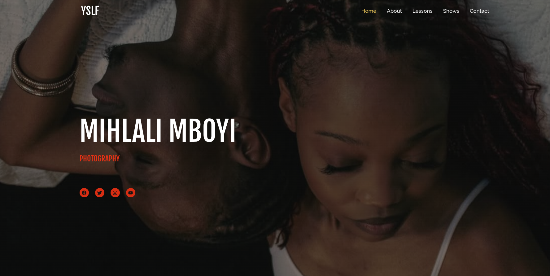
A full-bleed, image-led site for a photography studio, where the interface steps back and the work fills the screen.
- Client
- YSLF Studios
- Industry
- Photography
- Role
- UI/UX Design & Development
- Timeline
- 2 weeks
- Tools
- Figma, React, Headless CMS
What wasn't working
The studio's photography was strong, but a heavy gallery template loaded slowly on mobile and framed every image in the same small box.
What had to change
Give the photography the whole viewport, keep it fast on mobile data, and let the studio publish new series without a developer.
The decisions that shaped the interface.
- 01
Built the homepage as a single full-bleed image with the studio name and discipline set over it.
- 02
Reduced the interface to a name, a menu and the work itself.
- 03
Designed a mobile gallery with swipe navigation and generous tap targets.
Responsive image sets in modern formats with blur-up placeholders and progressive loading, so the first frame arrives immediately and galleries stream in behind it.
- React
- Image Optimisation
- Figma
- CMS
A quiet, cinematic site where a single photograph does the introducing, and the studio can publish a new series in minutes.
- 1.4s
- Mobile load time
- -76%
- Image payload
- +48%
- Gallery completion
- 0
- Developer edits needed
For visual work, performance is aesthetics. An image that arrives late is an image that was never seen.